Art and propaganda have long been used for disseminating political ideologies and beliefs. This year’s impending presidential election is no departure from this tradition.
While those running for office in the United States have employed campaign posters since the 19th century, using art as a form of political propaganda did not become fashionable and commonplace until World War I. With elected officials eager to inspire support for the war effort, the U.S. government commissioned various artists to create pieces that attempted to rally the American people.
“I Want You for U.S. Army” (1917), created by James Montgomery Flagg, serves as perhaps the most striking example of commissioned political art during this time period. Featuring a finger-wagging Uncle Sam with a seemingly bellicose grin, the poster intended to inspire young men to enlist in the army with a simple, albeit pernicious tagline: “I Want You for U.S. Army: Enlist Now.” Featuring the word “now” within the text imparted the poster with a sense of urgency, as if every single man who saw this needed to act immediately in order to protect the ideals of the United States and liberate Europe.
While the poster does appeal to the general public at large, it remains distinctly individualistic. The poster succeeds by placing nearly all of the emphasis on individual action, allowing men to uniquely envision themselves as capable of effecting change during the war. Uncle Sam’s gaze attempts to inspire on a personal level by targeting and beseeching any man that happens to meet his eyes.
World War II and the Red Scare prompted their own series of propaganda, with the former aiming to portray the United States’ enemies as brutal savages, and the latter denouncing communism and affirming democracy through images of nuclear apocalypse. It was not until the late 1960s and early 1970s, however, that the U.S. witnessed the proliferation of colored campaign posters, which replaced the previous black-and-white standard. These posters used a simple design that often featured a red, white and blue color palette and the name of the politician accompanied by a plea to elect or reelect said politician. A portrait of the politician comprised the bulk of the space on these posters. The posters from this time period may be less nuanced than earlier ones in the 20th century, seeing as the older ones had to rely on a clever tagline rather than bright colors to achieve their effect, but they did set the precedent for promotional campaign posters moving forward into the latter half of the 20th and 21st centuries.
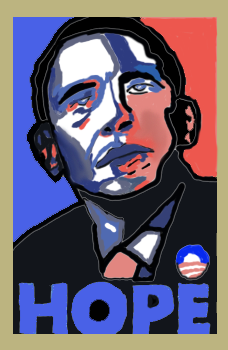
Most campaign posters continue in a similar style to those of the 1970s and 1960s until the release of Barack Obama’s iconic “Hope” (2008) poster, made by Shepard Fairey, which departed from this precedent in an extraordinary fashion. Featuring an expert use of color gradients despite the limited palette, this poster features a portrait of a pensive Obama with the word “Hope” inscribed at the bottom. Later editions would come to include similarly generalized words such as “Change” and “Progress,” but the design present within Fairey’s creation would go on to spark a multitude of parodies and imitations that played on the original image.
The poster’s success nevertheless relies on its modesty; by purposefully omitting the name of the presidential candidate, the poster encourages the viewer to focus on policies and social changes rather than vapid politicians and their personalities. A distinctly muted call to action, the “Hope” poster may have not completely altered the trajectory of campaign promotional posters, but it did defy the traditions of its time in a way that has not been accomplished since.
As obviously seen in “I Want You for U.S. Army,” manipulation lies at the very heart of every political artwork and piece of propaganda. Yet the most convincing pieces, such as the “Hope” poster, are those that subtly convince their audience to do or believe something without explicit pressure.
In the context of contemporary politics, Trump’s propaganda tactics assuredly rely on the use of the politician’s name; most of the promotional posters for his campaign draw attention to his infamous surname with some excluding Vice President and running mate Mike Pence altogether. While Trump’s campaign this year relies on a revision of last election year’s tagline (“Keep America Great!”), Biden’s posters by and large take a far more minimalistic approach. The majority of posters have Biden’s name appearing alongside Harris’s in a near equally sized font against a lighter background. The “E” in Biden’s name consists of three distinct red lines, which are evocative of an “=” sign, that contrast with the other blue letters.
However, promotional campaign posters and printed propaganda no longer require as intense displays of ingenuity or engaging content because of advances in media production and circulation. The days of candidates attempting to convince constituents to vote for them through a yard sign poster in their neighbor’s yard have long since passed. Instead, they can voice their opinions, thoughts and beliefs through a near infinite amount of channels, such as radio, television and the Internet. While the art of printed political propaganda may be declining as the world moves towards a more digital future, the public can rest assured that this trend will not necessarily coincide with a loss in innovation or creative content. Political artists and artists commissioned by politicians are bound to explore how to create convincing propaganda, albeit in different formats.
Subscribe to the Mossy Log Newsletter
Stay up to date with the goings-on at Lewis & Clark! Get the top stories or your favorite section delivered to your inbox whenever we release a new issue.

Leave a Reply